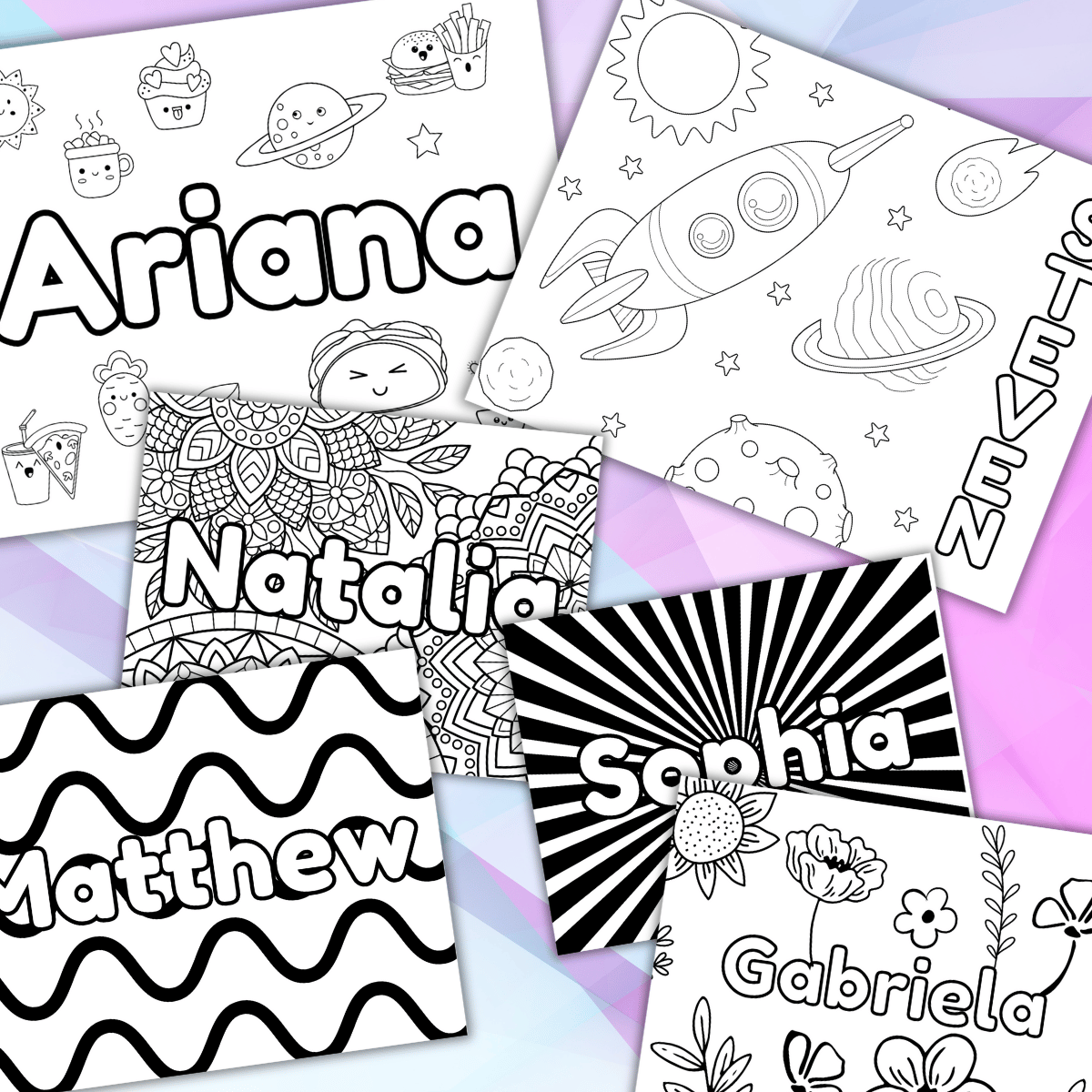
Coloring Your Name
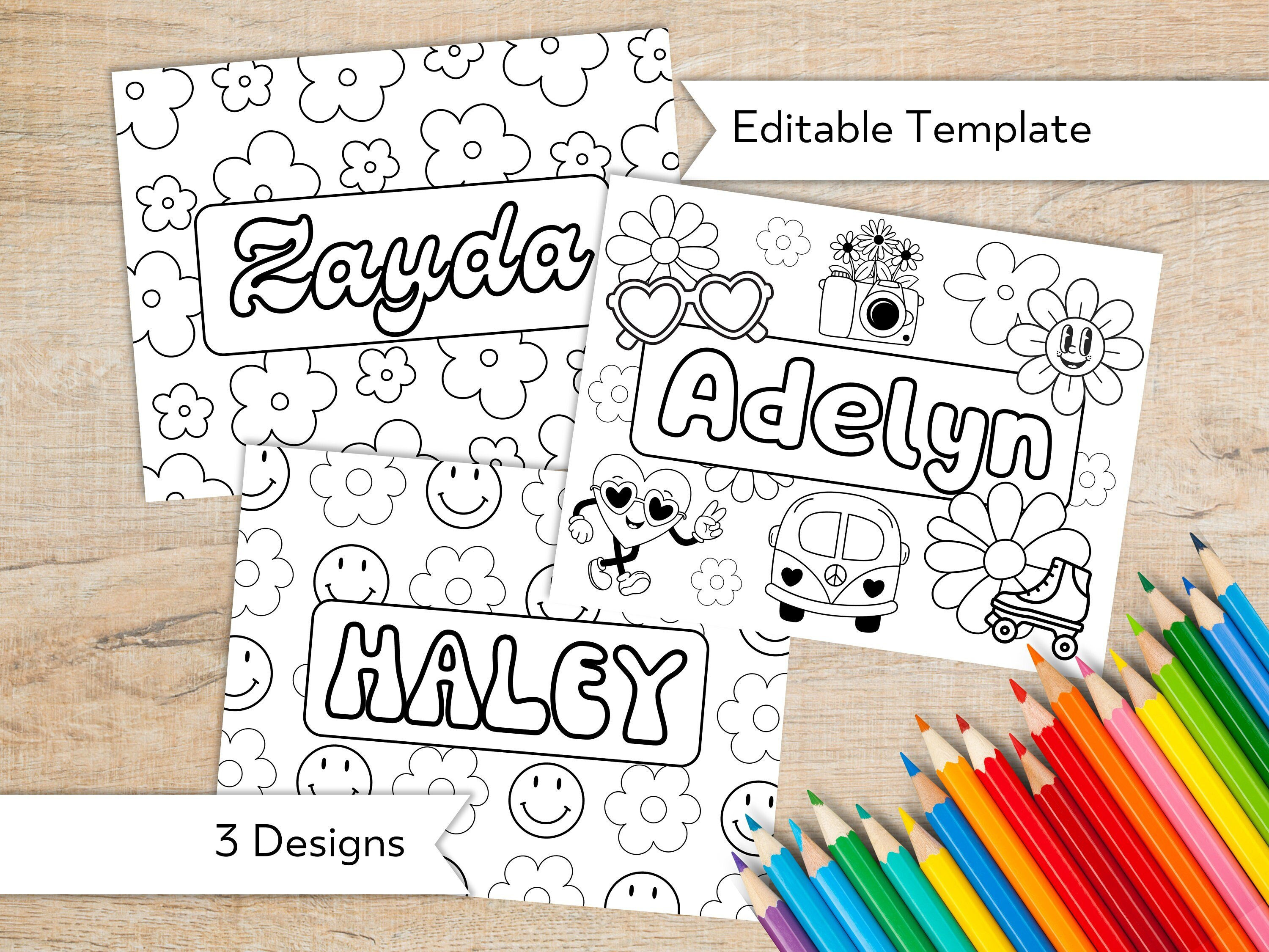
Coloring your name can be a joyful way to express personality, creativity, and identity through color, pattern, and intentional letter design. Whether you experiment with playful rainbow gradients, bold monochrome styles, or intricate zentangle-inspired details, the act of coloring your own name turns a simple signature into a small work of art. This guide explores practical techniques, creative ideas, and helpful tips so you can bring your name to life with color and flair.
Why Color Your Name
Coloring your name is more than a decorative habit; it is a form of visual self-expression that combines typography, color theory, and personal symbolism. By choosing specific hues, you can convey mood, energy, and meaning, turning an everyday label into a memorable emblem. This practice is popular among artists, journalers, students, and professionals who want to add a personal touch to planners, notebooks, presentations, and social media graphics.
Beyond aesthetics, coloring your name can support mindfulness and relaxation. The repetitive, focused strokes of filling letters with color encourage presence and calm, similar to adult coloring trends. It also helps develop an eye for color harmony, contrast, and balance, which can improve your overall design intuition. You may find that a small, colorful signature becomes a reassuring, uplifting motif in your daily routine.
Choose Your Style
Before you begin, decide on a style that matches your personality and the feeling you want to communicate. A few popular approaches include:
- Rainbow lettering: Gradually shift colors across the letters for a vibrant, spectrum effect.
- Monochrome elegance: Use different shades, tints, and tones of a single color for a sophisticated look.
- Bold contrast: Pair strong complementary colors for high impact and readability.
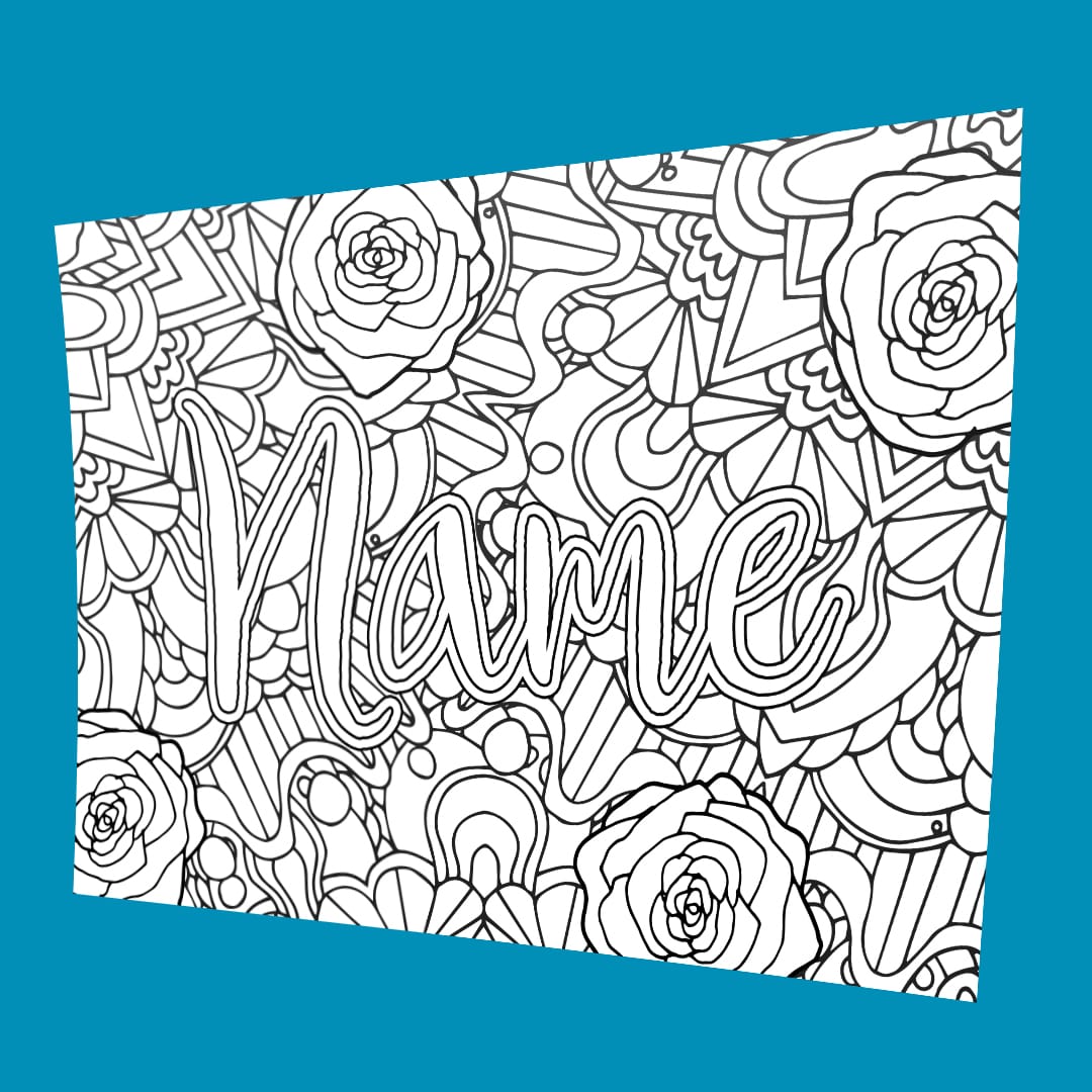
- Zentangle and pattern: Fill each letter with intricate patterns, dots, and textures for a highly detailed design.
- Minimalist line art: Use thin color accents and negative space to create a modern, clean appearance.
Consider the context in which your colored name will be seen. A playful, colorful style may be perfect for casual journals or social media avatars, while a refined monochrome palette can work beautifully for professional branding or formal invitations. Sketch a few quick concepts to see which style feels most authentic to you.
Pick Your Color Palette
Your choice of colors dramatically influences the mood and impact of your design. Start by exploring simple palettes and gradually refine them based on contrast, harmony, and personal preference.
- Analogous palettes: Colors next to each other on the color wheel, such as blue, teal, and green, create a smooth, cohesive feel.
- Complementary pairs: Opposite colors on the wheel, like orange and blue, generate dynamic contrast and visual interest.
- Triadic schemes: Three colors evenly spaced on the wheel, such as red, yellow, and blue, offer balanced vibrancy.
- Neutral bases with a pop: Use grays, whites, or beiges as a backdrop, then introduce one bright hue to highlight specific letters.
Test your palette on a separate sheet before applying it to your name. Observe how the colors interact, whether they remain legible, and if they evoke the emotion you intend. Remember that saturation and value play a big role: highly saturated colors feel energetic, while desaturated tones feel muted and calm. Adjust the lightness and darkness of your hues to ensure strong contrast between letters and background.
Techniques and Tools
You can color your name using a variety of tools, from everyday stationery to more specialized art supplies. The right tools help you achieve smooth gradients, precise edges, and consistent coverage.
- Colored pencils: Ideal for layering, shading, and blending. Use a colorless blender or light pencil strokes to create smooth transitions.
- Markers: Alcohol-based markers work well for bold, saturated color, while water-based markers are beginner-friendly and easy to layer.
- Watercolors: Offer fluid, translucent washes. You can paint your letters freely or use masking fluid to preserve white space.
- Gel pens and fineliners: Great for adding crisp outlines, highlights, and decorative details.
- Digital tools: If you prefer a screen-based approach, apps with brush stabilizers and layer controls let you experiment freely without waste.
Start by lightly sketching your name in pencil to establish spacing and proportions. Then, apply base colors, followed by shading and highlights to add dimension. Use directional strokes that follow the shape of each letter for a more cohesive look. For complex patterns within letters, work slowly in small sections and build up color gradually to maintain control.

Tips for Readability and Balance
It is easy to get carried away with intricate designs, but maintaining readability is essential. If your colored name is hard to recognize, the visual impact is lost. Focus on letter spacing, line consistency, and contrast to keep your design clear and legible.
- Ensure strong contrast between letters and background, especially for script or cursive styles.
- Keep key strokes distinct, avoiding overly busy patterns in critical areas like crossbars and loops.
- Use color blocking to separate letters subtly, which can improve recognition without reducing cohesion.
- Step back frequently to view your work from a distance; this helps you spot balance issues and adjust accordingly.
Balance your design by distributing color weight evenly. Darker, saturated areas naturally draw the eye, so place them thoughtfully to avoid tipping the composition to one side. If one side of your name feels heavy, add small highlights or lighter tones on the opposite side to restore harmony. Practicing on grid or lined paper can also help you maintain consistent letter size and alignment.
Bring Your Art to Life
Once you are satisfied with your colored name, consider how you will share or preserve it. You might create a series of designs for a personal art project, incorporate your colorful signature into handmade cards, or use it as a unique element in digital graphics. Scanning or photographing your work lets you experiment with digital effects, such as subtle filters or collage elements, while keeping the original piece intact.
Share your progress with friends, family, or online communities to gain feedback and inspiration. You may discover new techniques, unexpected color combinations, or style ideas that elevate your future work. Most importantly, enjoy the process of coloring your name as a way to celebrate individuality, practice creativity, and add a personal signature to the world around you.
The Weeknd - Call Out My Name (Official Video)
Music video by The Weeknd performing Call Out My Name.© 2018 The Weeknd XO, Inc., manufactured and marketed by ...
